









Blog, fountain-pen-guides
Fountain Pen Nib Size Comparison: The Ultimate Guide to EF, F, M, B, Stub & Architect Nibs
Jul
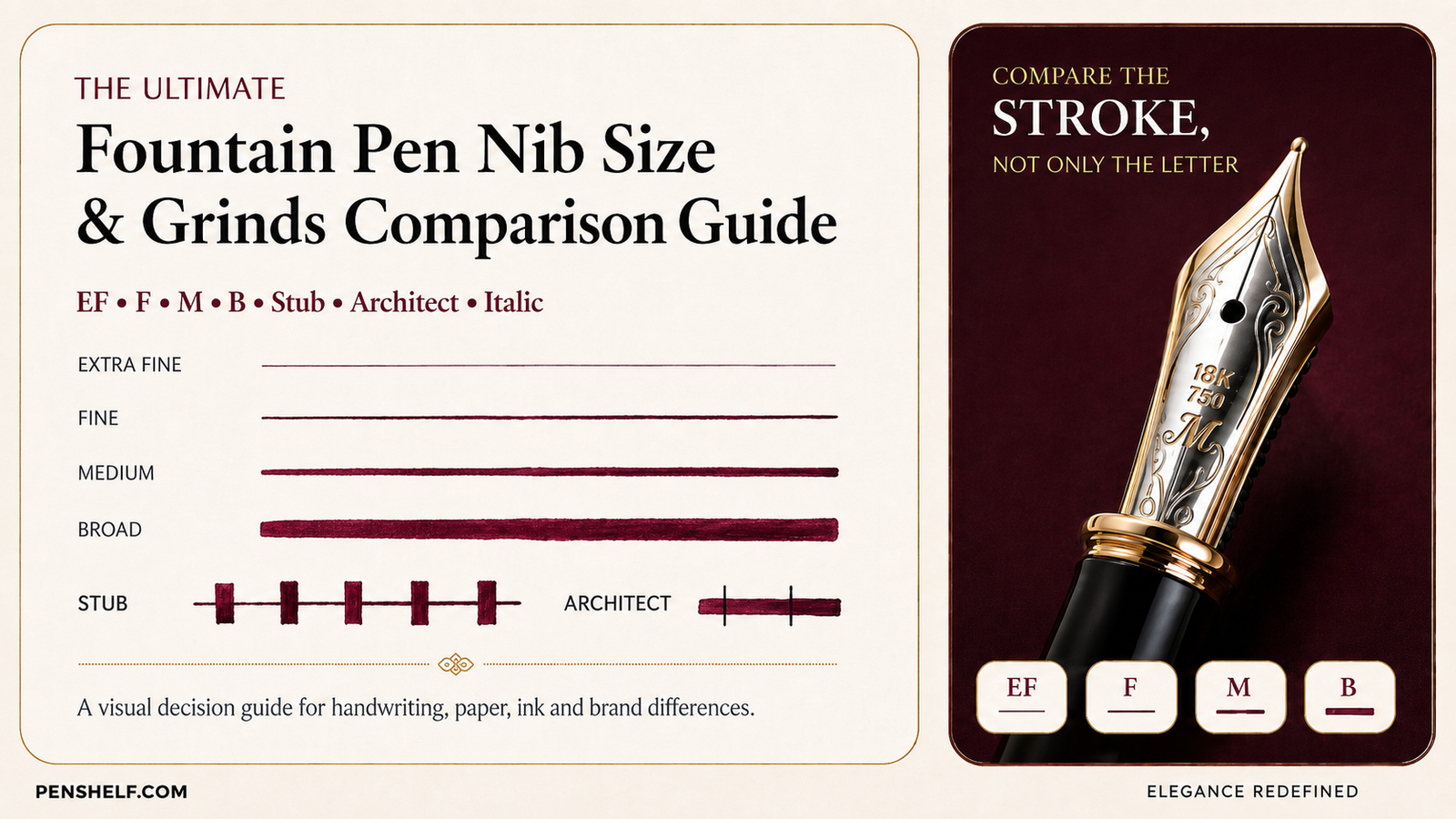
Which fountain pen nib size should you buy? The honest answer is not simply “Fine for small writing, Medium for normal writing.” A Pilot Fine and a LAMY Fine may produce visibly different lines. The same nib may also write wider on absorbent office paper, feel rougher with a dry ink, or become a smudge risk for a left-handed side-writer.
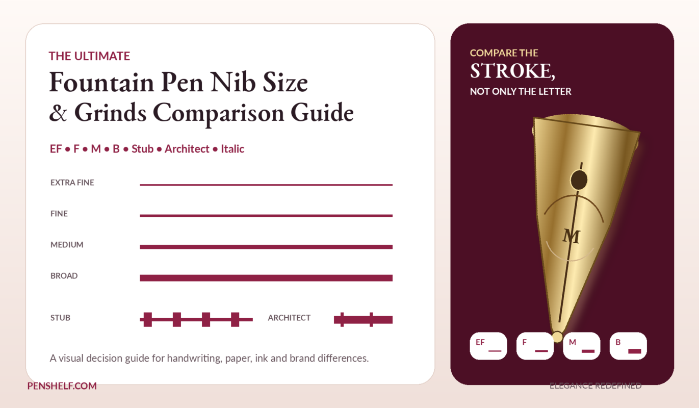
This fountain pen nib size comparison guide brings those variables together. You can compare Extra Fine vs Fine vs Medium vs Broad nibs, understand Japanese vs Western nib sizes, see how Stub, Cursive Italic and Architect grinds change horizontal and vertical strokes, and use the interactive quiz to find your likely starting point.
The 20-second answer
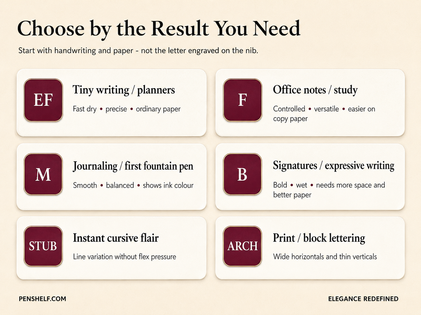
Choose Extra Fine for tiny handwriting, planners and weak paper. Choose Fine for everyday office or study notes. Choose Medium for a smoother first fountain pen and richer ink colour. Choose Broad for signatures, large handwriting, shading and sheen. Choose a Stub for easy cursive flair and an Architect for bold horizontal strokes in print or block lettering.
Brand rule of thumb: a Japanese Medium often writes close to a Western Fine, but model, ink, paper and tuning can overturn that shortcut.
Find your nib in under a minute
Select how you actually write. The tool weighs handwriting size, paper, purpose, handedness and the ink effect you want.
How do you write?
Answer nine quick questions. No option is selected automatically.
Select all nine answers to unlock your recommendation.
Powered by Penshelf
Your answers are used only on this open page and are not saved.
Fine nib
A versatile starting point for everyday writing.
Recommended pens at Penshelf
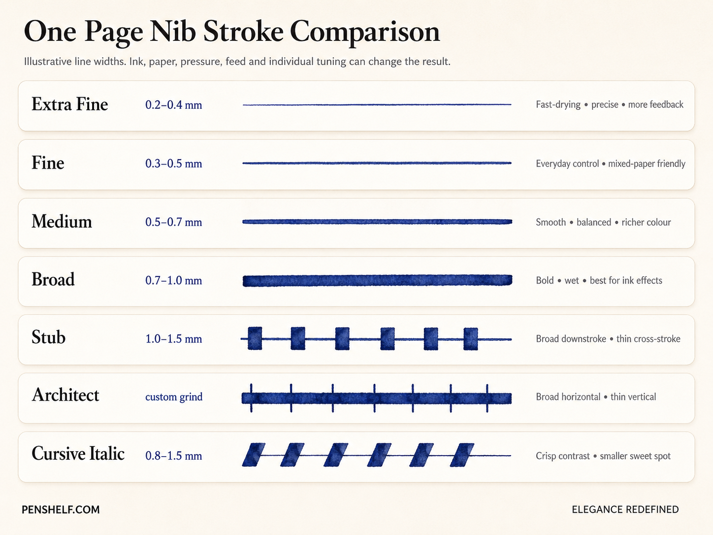
Fountain pen nib size chart: EF, F, M and B
| Nib | Typical line | Writing feel | Best use | Watch for |
|---|---|---|---|---|
| Extra Fine (EF) | Approx. 0.2–0.4 mm | Precise, tactile | Planners, tiny handwriting, corrections | More feedback on rough paper |
| Fine (F) | Approx. 0.3–0.5 mm | Controlled, versatile | Office notes, study, everyday writing | Less ink shading than M/B |
| Medium (M) | Approx. 0.5–0.7 mm | Smooth, forgiving | Journaling, letters, first fountain pen | Can look thick in small handwriting |
| Broad (B) | Approx. 0.7–1.0 mm | Wet, smooth, expressive | Signatures, ink display, large writing | Slow dry time and feathering |
| Stub | Usually 1.0–1.5 mm | Rounded directional variation | Cursive, headings, cards | Needs controlled rotation |
| Architect | Custom grind | Wide horizontal, thin vertical | Print, capitals, sketch annotations | Highly angle-dependent |
Important: these are orientation ranges, not universal standards. “Nib size” may refer to tipping width, while the visible ink line changes with wetness, paper absorbency, ink surface tension, pressure, writing speed and the individual nib.
Extra Fine nib: maximum precision, minimum ink
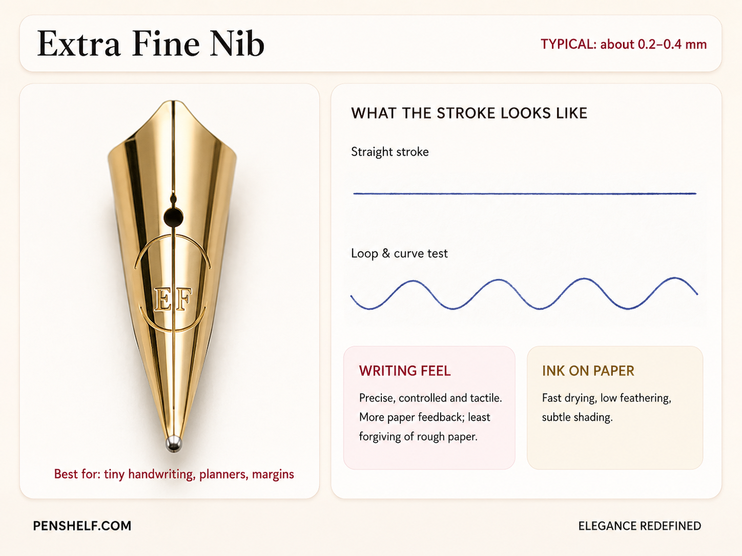
An Extra Fine fountain pen nib is the closest choice for people moving from a 0.3 mm gel pen, writing inside compact planners, annotating documents or using inexpensive office paper. Because the contact area is small, you feel more of the paper texture. That sensation may be pleasant “pencil-like feedback” or unpleasant scratchiness depending on alignment, ink and paper.
Choose EF when…
- Your lowercase letters are usually under 3 mm high.
- You write in margins, calendars, forms or densely ruled notebooks.
- You need faster drying and lower feathering on ordinary paper.
- You are a left-handed side-writer or overwriter trying to reduce wet ink.
Do not choose EF only because it sounds precise. On textured paper, a very fine nib can catch fibres, feel dry and reveal every tiny misalignment.
Fine nib: the safest everyday choice
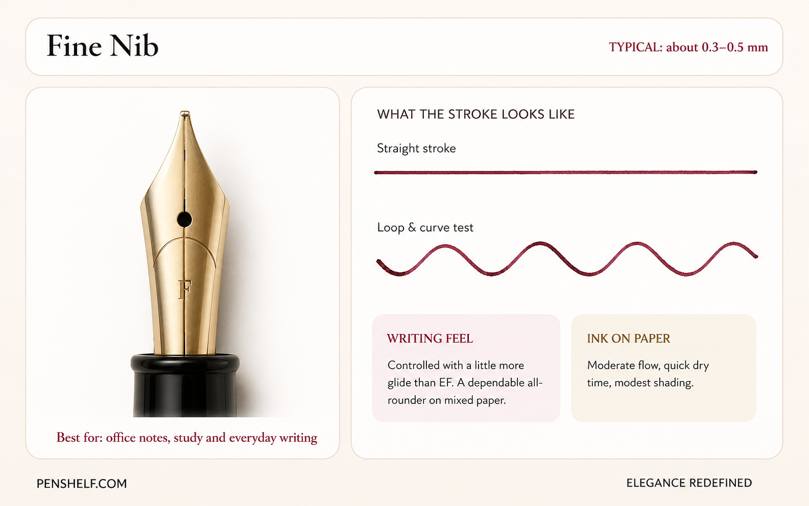
For most people searching for the best fountain pen nib size for note taking, Fine is the lowest-risk starting point. It is narrow enough for office paper and compact handwriting but broad enough to feel smoother than many Extra Fine nibs.
A Western Fine or Japanese Medium is often a practical first target for daily writing. It leaves enough white space inside letters such as “e”, “a” and “o”, while still showing more ink colour than an ultra-fine point.
Fine nib writing feel
Expect controlled glide with moderate feedback. A wet Fine can feel smoother and write wider than a dry Medium, which is why comparison samples should use the same ink and paper.
Medium nib: smooth, forgiving and ink-friendly
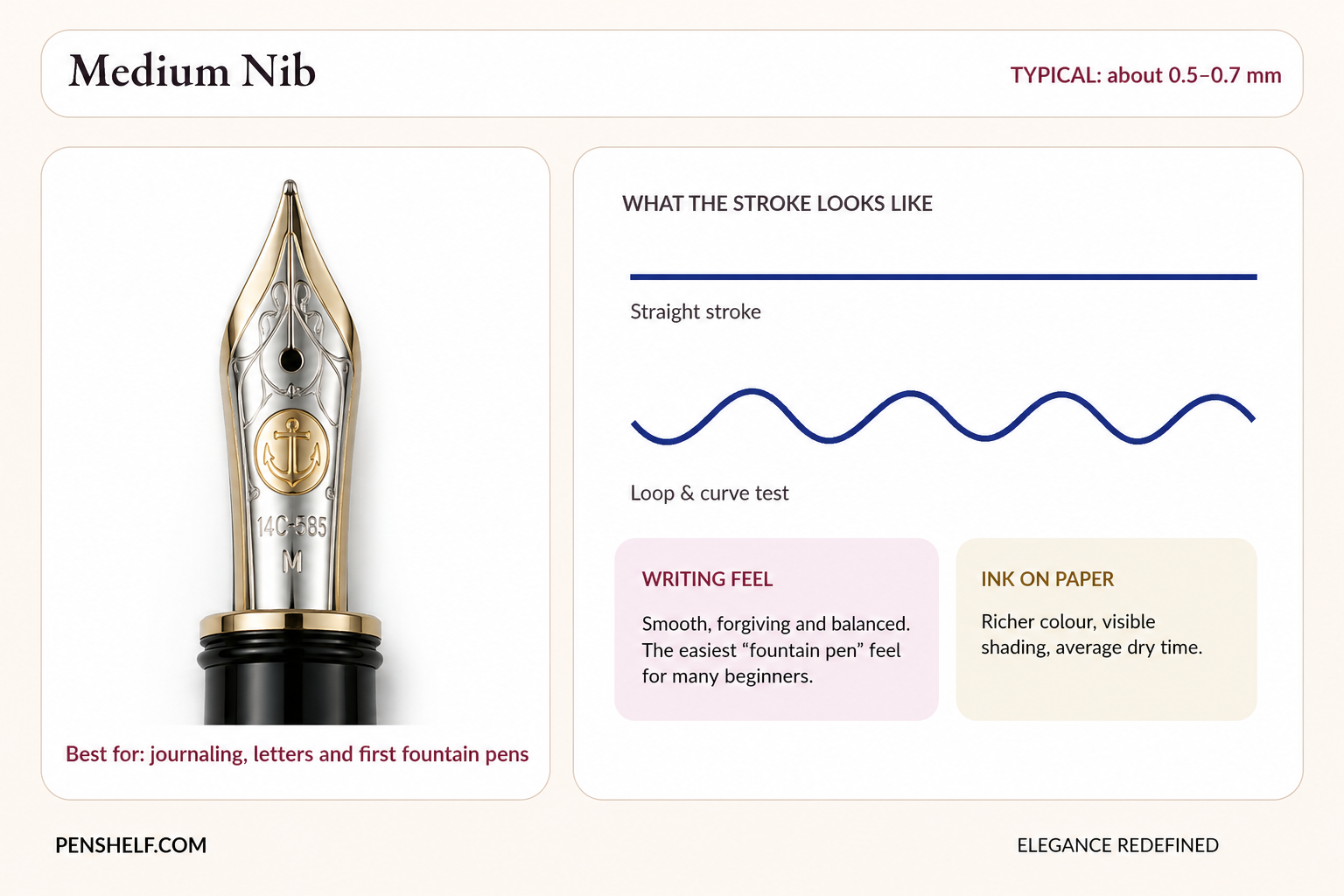
A Medium fountain pen nib is the classic “this is why people love fountain pens” experience: more ink acts as lubrication, the nib glides over small paper imperfections, and the colour looks richer. It is especially good for journaling, correspondence and relaxed long-form writing.
Medium is not automatically the best beginner nib. Someone with tiny handwriting or a daily supply of copier paper may find it too wet. Conversely, someone who dislikes the tactile feel of Fine nibs may enjoy Medium immediately.
Fine vs Medium nib
Choose Fine for compact letters, mixed paper and faster drying. Choose Medium when smoothness, colour and a more generous ink line matter more than fitting maximum words on the page.
Broad nib: bold writing and the full personality of ink
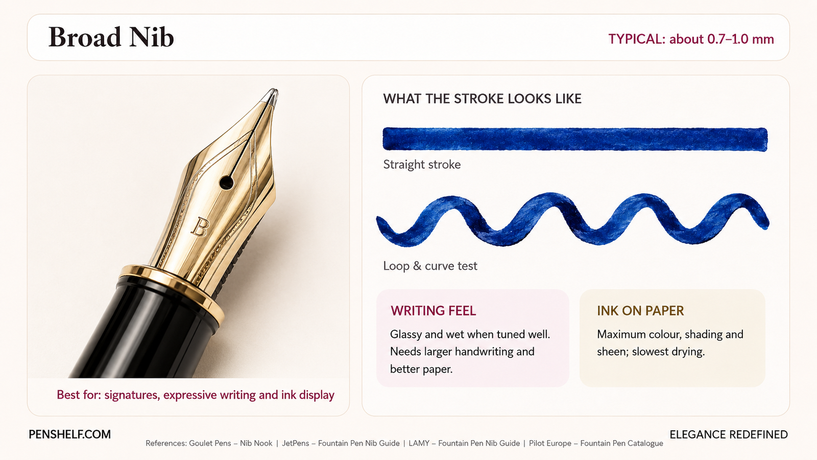
A Broad fountain pen nib is not only for oversized signatures. It can improve legibility by encouraging larger, more open letterforms, and it reveals properties that finer nibs may hide: shading, sheen, shimmer and subtle colour separation.
The trade-off is practical. A broad wet line takes longer to dry, consumes more ink and can feather or bleed on absorbent paper. It suits fountain-pen-friendly notebooks, unhurried writing and anyone who wants the ink to be part of the visual experience.
Specialty nib grinds: Stub vs Italic vs Architect
Round EF, F, M and B nibs try to make horizontal and vertical strokes similar. Specialty grinds deliberately make them different.
Stub nib: easiest line variation for everyday cursive
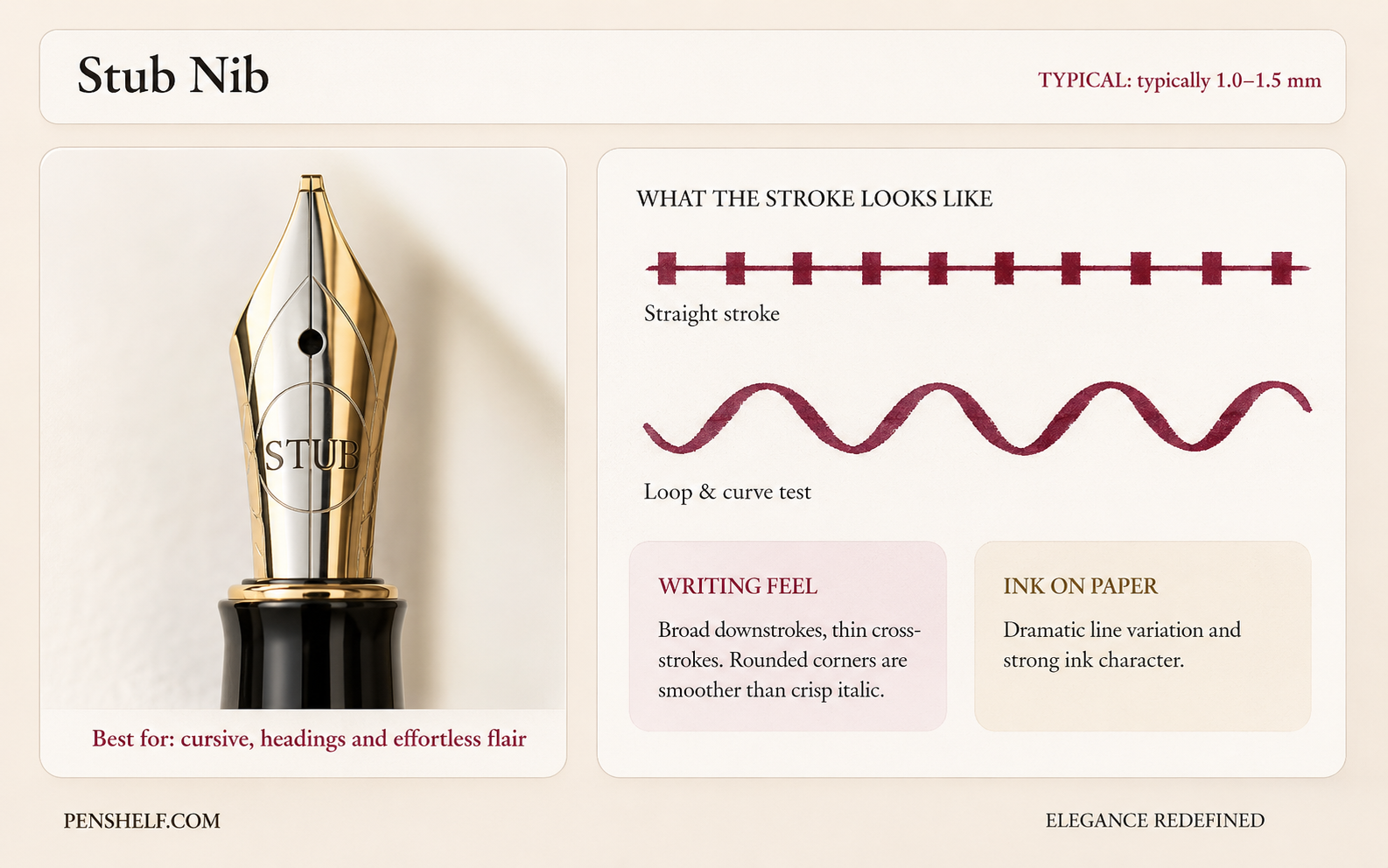
A Stub has a wide writing edge with rounded corners. It makes downstrokes broader and cross-strokes thinner without requiring pressure. The rounded edge makes it more forgiving than a crisp italic, although it still has a smaller sweet spot than a round nib.
Cursive Italic nib: sharper, crisper and more demanding
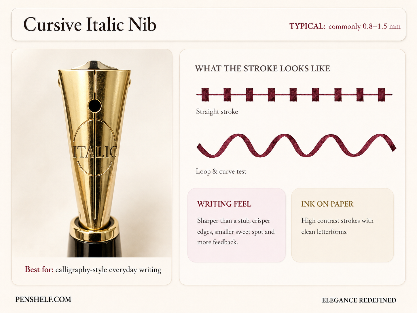
A Cursive Italic sharpens the contrast. Its corners are less rounded, so letter edges look cleaner, but rotation and writing angle matter more. It rewards a consistent hand and punishes twisting the pen through a stroke.
Architect nib: the line variation turned sideways
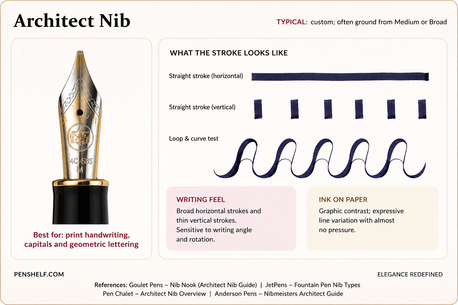
An Architect nib produces broad horizontal strokes and thin vertical strokes—the reverse of a conventional Stub. It is particularly striking in print, block capitals, headings and architectural-style annotation. Because it is normally ground for a specific writing angle, buying one without considering how steeply you hold the pen can lead to a poor sweet spot.
Stub vs Architect nib: which is better?
Choose Stub when you mainly write connected cursive and want broad downstrokes. Choose Architect when you print, use block letters or want emphatic horizontal strokes. Neither is objectively better; the correct grind follows your dominant stroke direction and pen angle.
Japanese vs Western nib sizes: why the same letter does not mean the same line
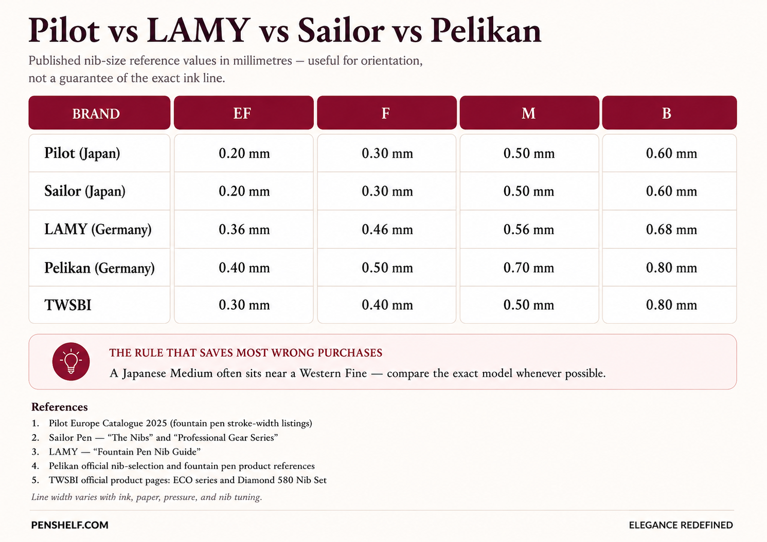
There is no industry-wide rule that says every Fine nib must produce one fixed line width. Japanese brands commonly make finer points, while many European brands write broader and wetter. Even inside one brand, model, feed, material and manufacturing tolerance can create overlap.
Pilot vs LAMY nib size
As a starting approximation, a Pilot Medium may sit near a LAMY Fine, while a Pilot Fine can be much narrower than a LAMY Fine. That is why a shopper who loves a Pilot Fine should not automatically order “Fine” from every brand.
Why can an Extra Fine write wider than a Fine?
Letter grades represent ranges, not perfectly separated measurements. A wet EF at the broad end of its tolerance can overlap a dry F at the narrow end. Absorbent paper then spreads the wetter line further. Misalignment, tine gap and ink chemistry can widen or narrow the visible result again.
The paper-and-ink test most nib guides forget
Before judging a nib, test it using the paper and ink you will actually use. Draw five parallel lines, write lowercase “minimum”, add loops, then hold the nib at your normal angle for a slow diagonal. Check:
- Line width: Do enclosed letters remain open?
- Feathering: Do fibres pull ink away from the stroke?
- Dry time: Can your hand reach the line before it dries?
- Sweet spot: Does the nib skip when you rotate naturally?
- Feedback: Is the sensation controlled, or is one direction sharply scratchy?
One-direction scratchiness often points to tine alignment rather than a nib being “too fine.” Do not aggressively polish a new nib before checking alignment and warranty conditions.
Quick recommendations by handwriting and use
| Your situation | Start here | Alternative | Why |
|---|---|---|---|
| Very small handwriting | Japanese F | Western EF | Keeps counters and spacing clear |
| Daily office notes on mixed paper | Western F | Japanese M | Balances control, smoothness and dry time |
| First fountain pen | F or M | Japanese M / Western F | Less extreme and easier to evaluate |
| Left-handed side-writer | F | EF with smooth paper | Less wet ink in the hand path |
| Ink shading and sheen | M or B | Stub | Places enough ink to reveal effects |
| Signature pen | B | Stub | Creates visual authority and contrast |
| Everyday cursive with flair | Stub | Cursive Italic | Variation without flexing pressure |
| Print and block capitals | Architect | Stub rotated by style | Emphasises horizontal geometry |
Frequently asked questions
What is the best fountain pen nib size for beginners?
A Western Fine or Japanese Medium is the safest general starting point. Choose Medium when smoothness and ink colour matter more; choose Fine when handwriting is small or paper quality varies.
Is a Fine nib better than a Medium nib?
Fine is better for compact writing, ordinary paper and faster drying. Medium is usually smoother and displays ink colour, shading and lubrication more clearly.
Are Japanese nibs finer than European nibs?
Generally yes, especially in EF and F grades, but it is a rule of thumb rather than a universal conversion. Compare the exact brand and model.
What nib size is best for small handwriting?
Start with Japanese Fine or Western Extra Fine. Writers who dislike strong feedback may prefer a smooth Japanese Medium or Western Fine and slightly enlarge their lettering.
What nib size is best for left-handed writers?
Fine or Extra Fine often reduces wet ink and smudging, but hand position matters. Underwriters can use almost any nib; side-writers and overwriters should prioritise dry time, paper and a forgiving sweet spot.
Does a gold nib write smoother than a steel nib?
Not automatically. Tipping shape, alignment, polishing, feed flow and tuning determine smoothness. Gold may feel softer or springier in some designs, while a well-tuned steel nib can be extremely smooth.
Is a Stub nib suitable for daily writing?
Yes, especially a rounded 1.0 or 1.1 mm Stub used with medium-to-large handwriting. It requires more consistent rotation than a round nib and may be too wide for tight ruled paper.
Can an Extra Fine nib be wetter or wider than a Fine nib?
Yes. Manufacturing ranges overlap, and ink flow plus absorbent paper can make a wet EF appear broader than a dry F.
How to use this guide responsibly
The millimetre figures are comparison references, not promises.